Day 28: Is this a chart or a map? | #30DayMapChallenge
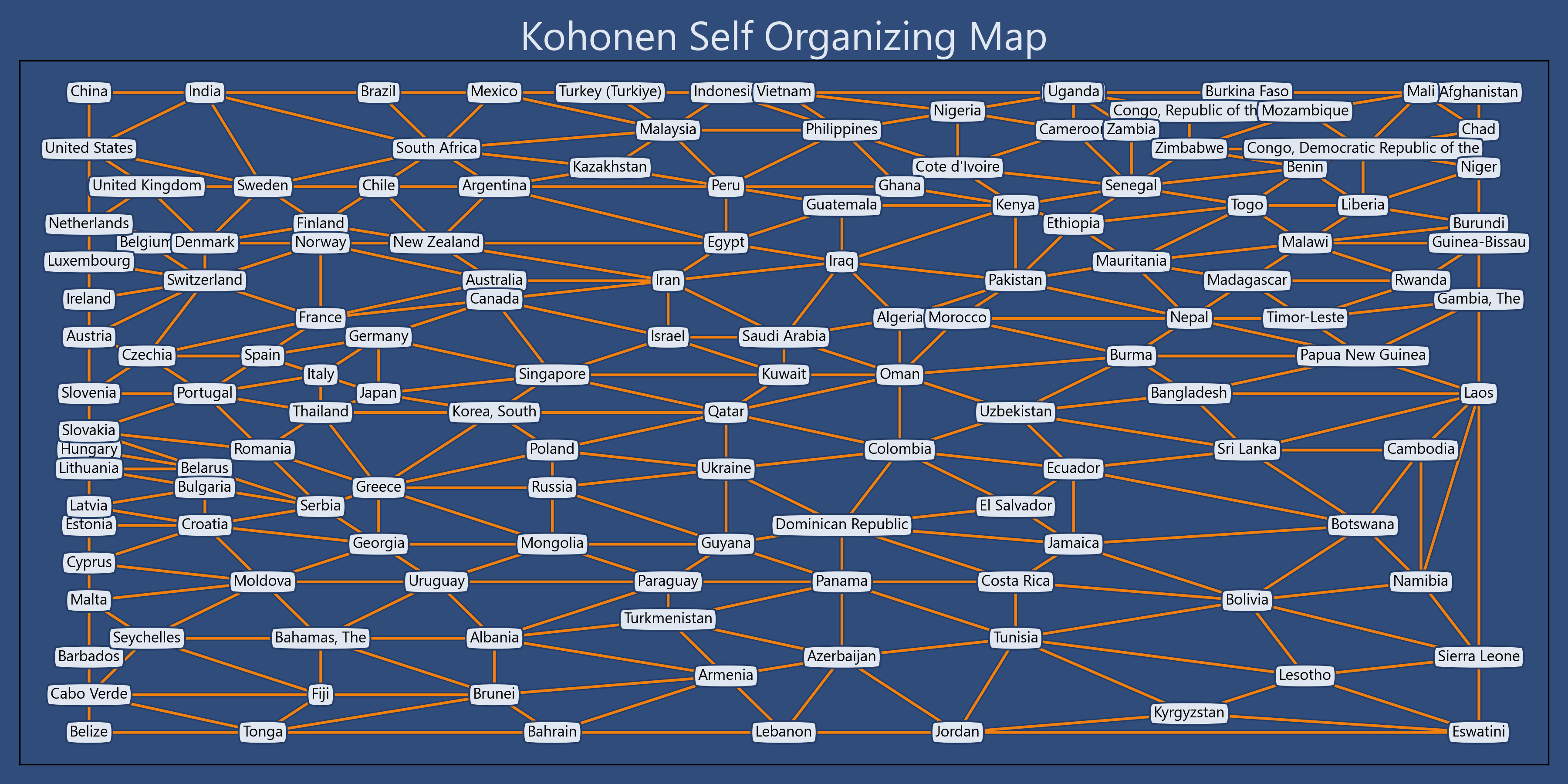
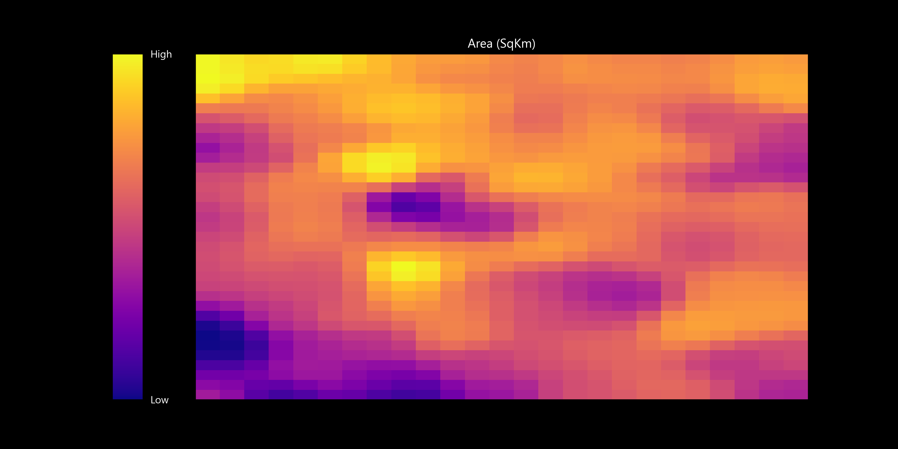
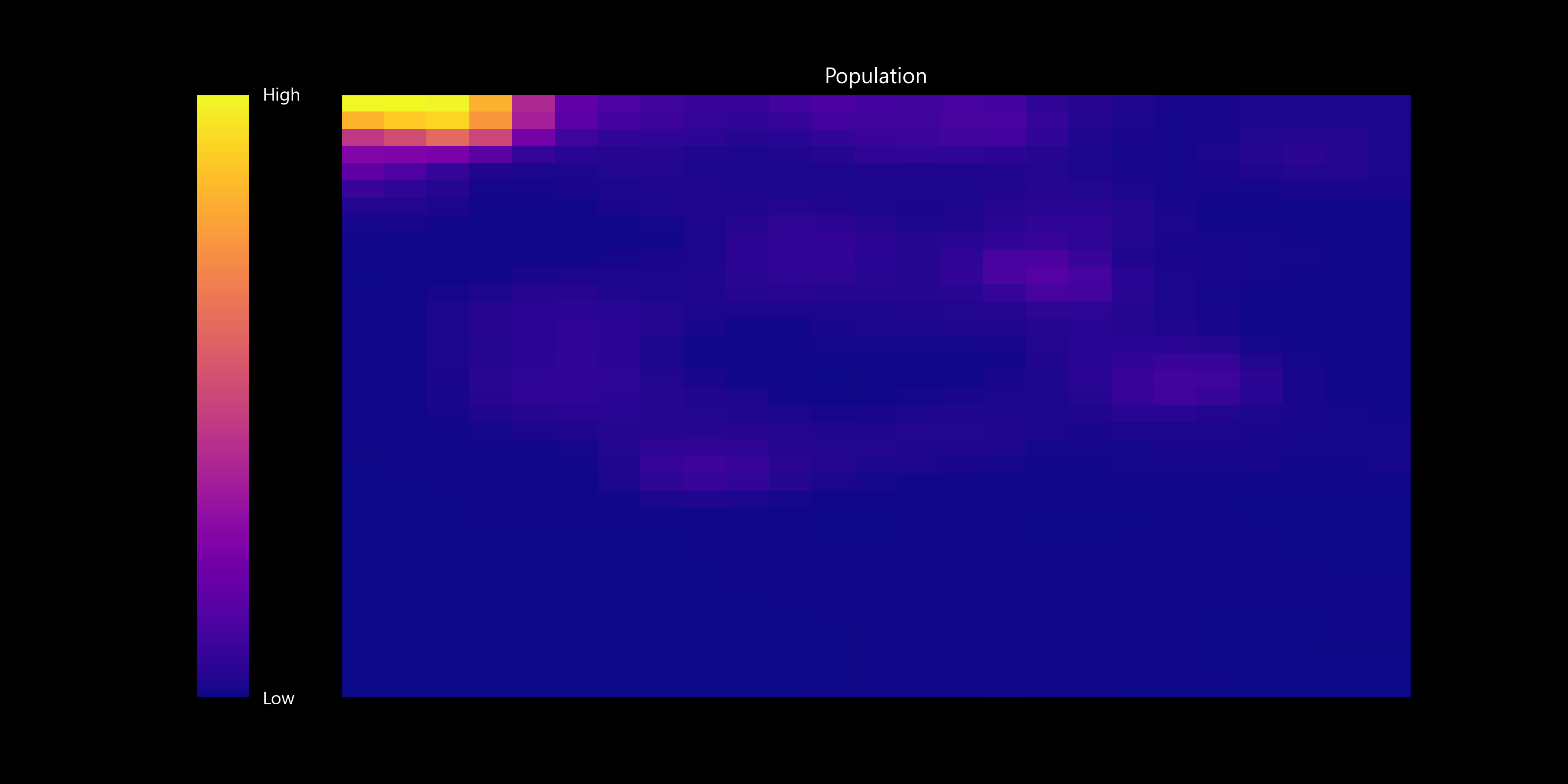
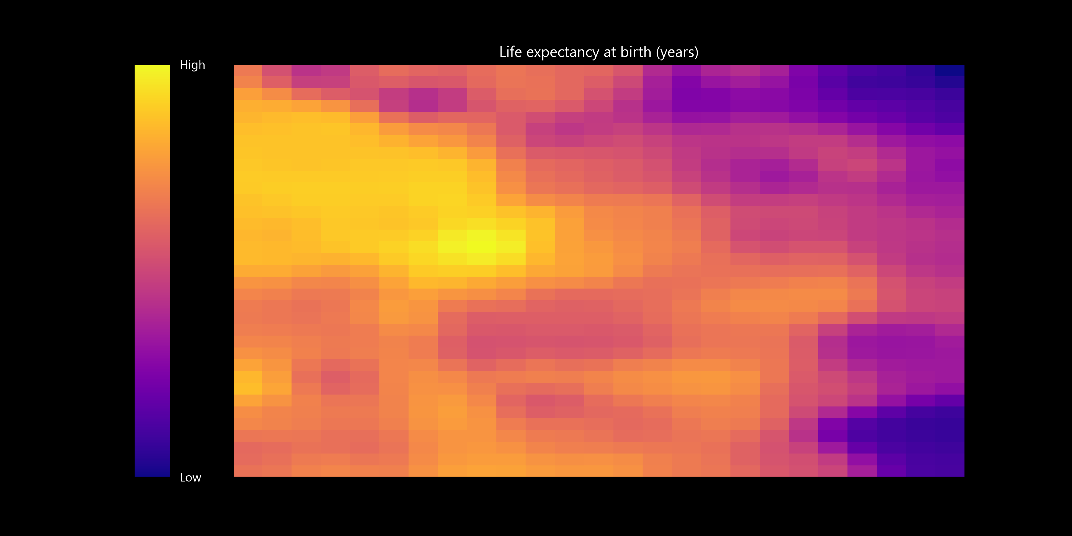
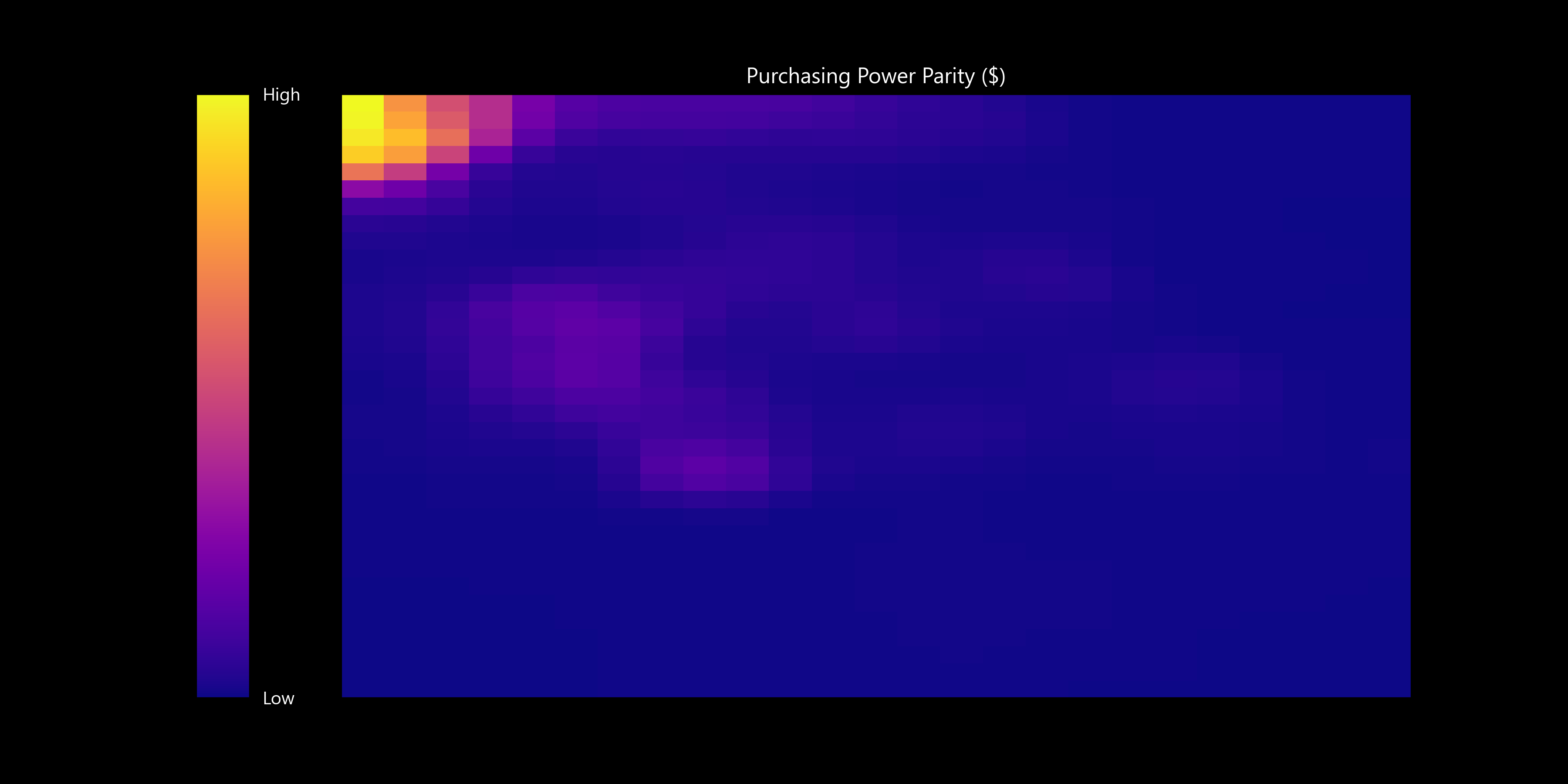
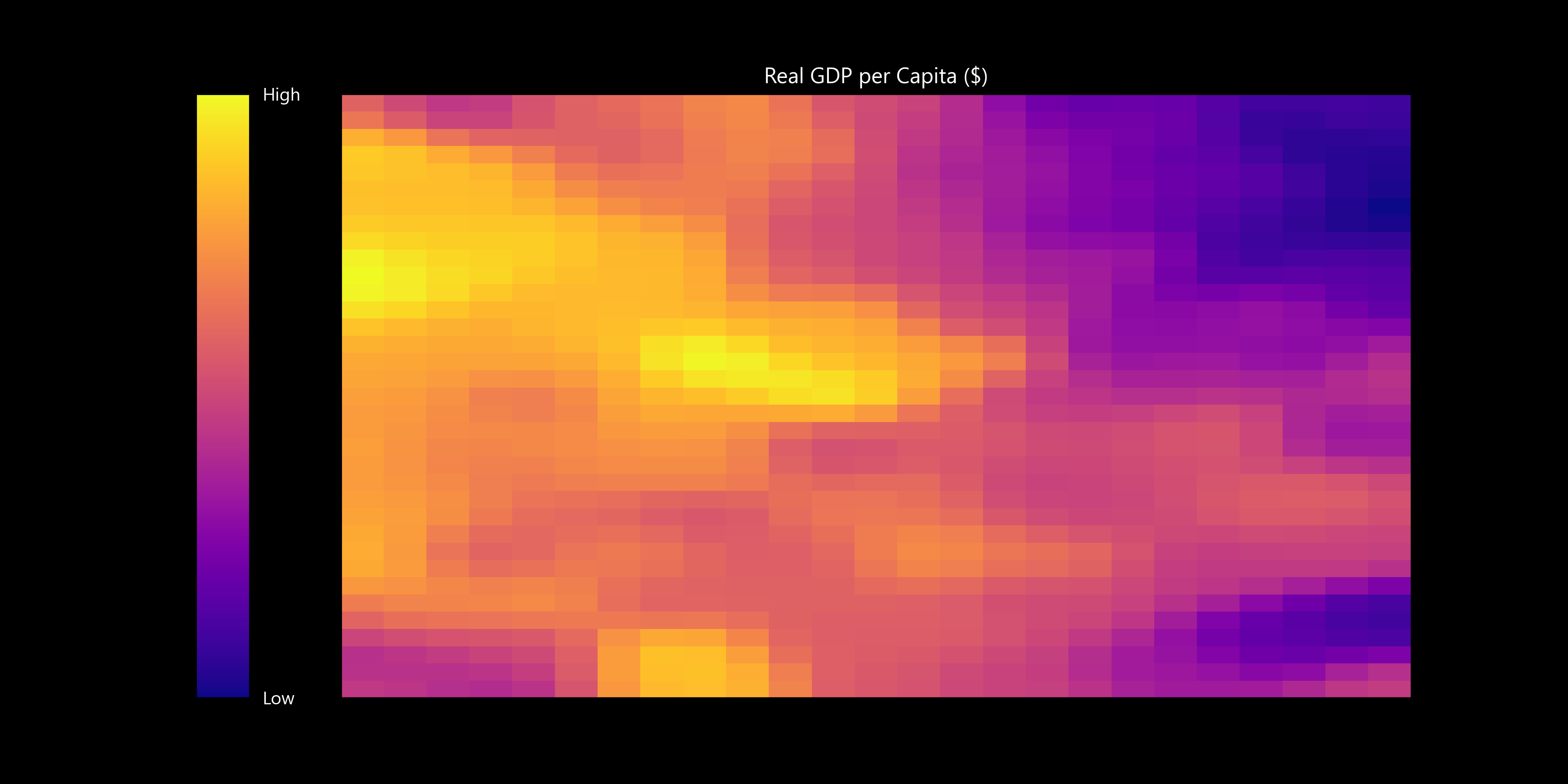
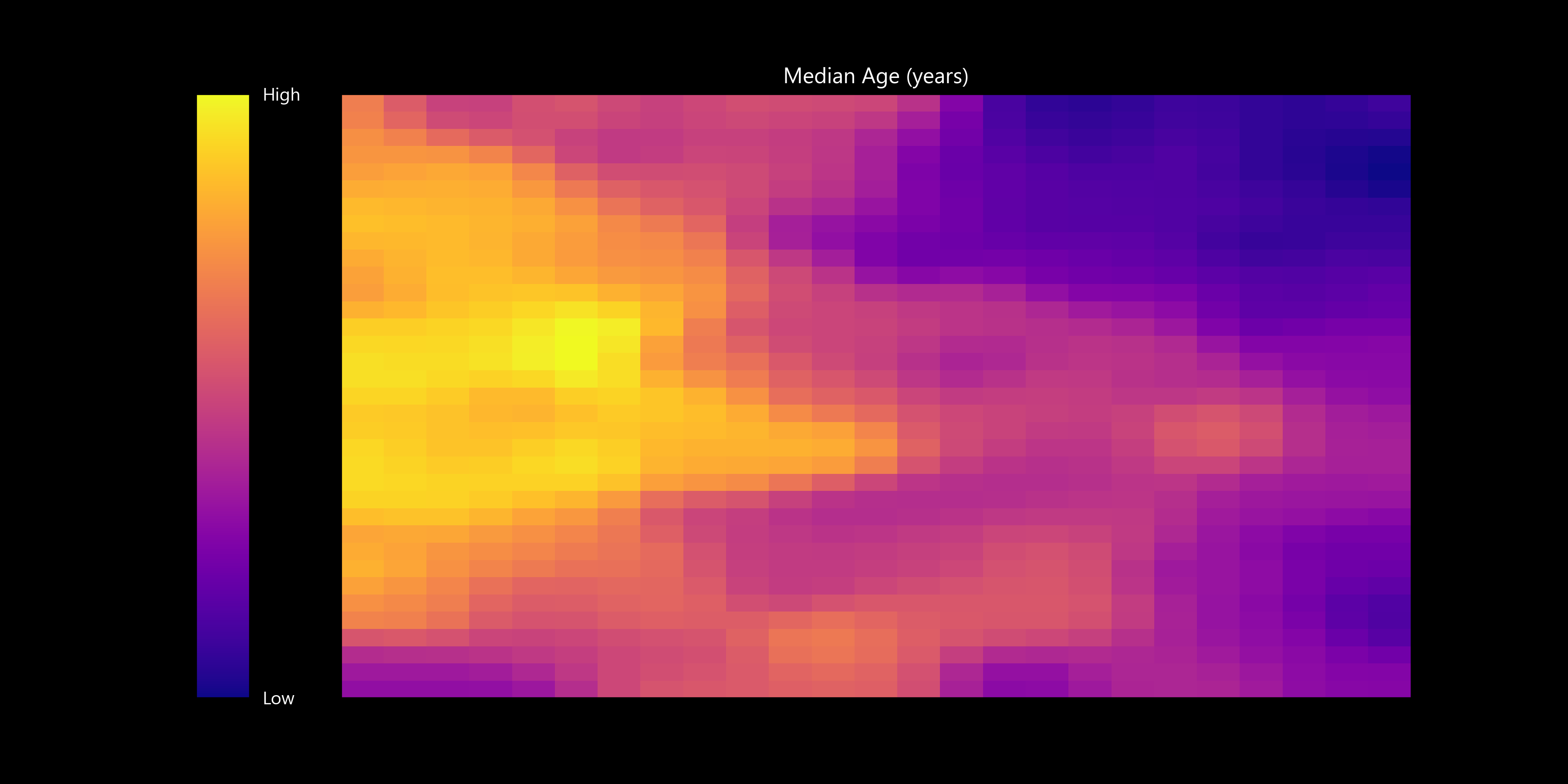
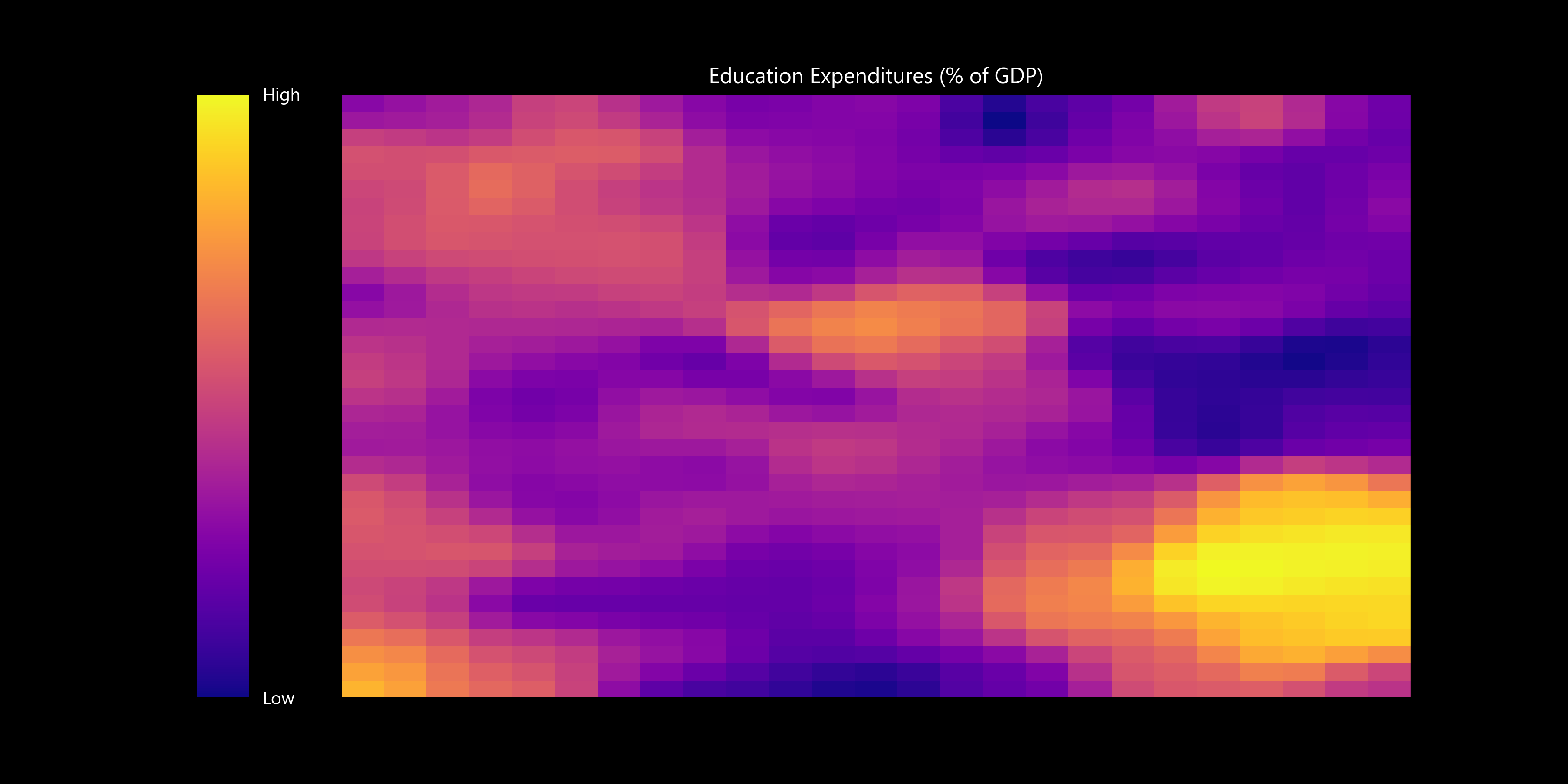
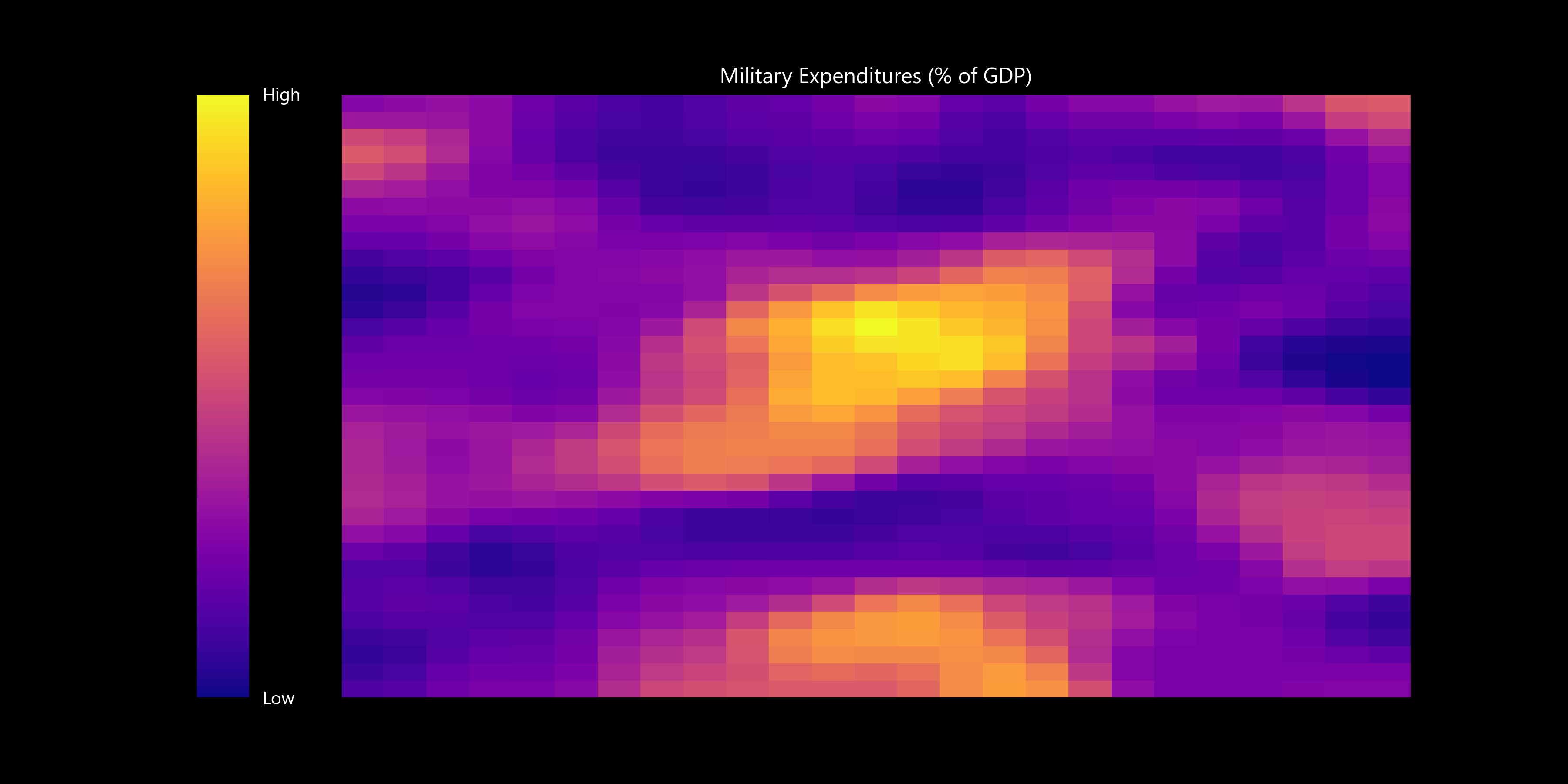
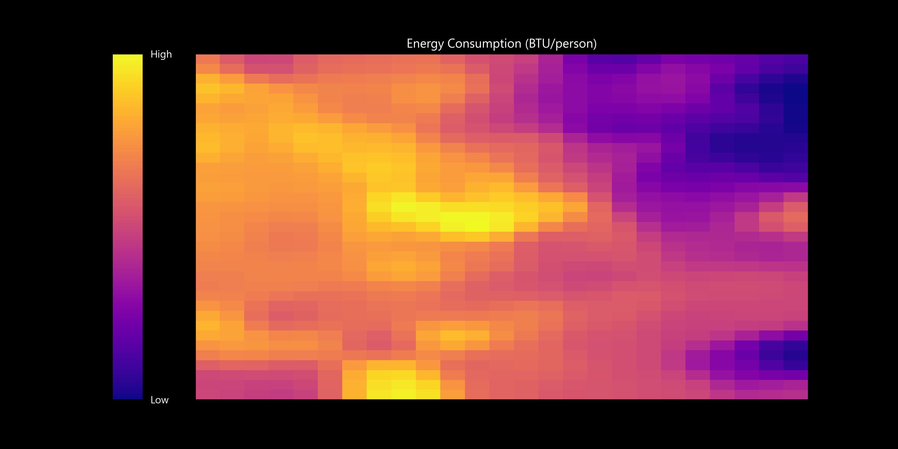
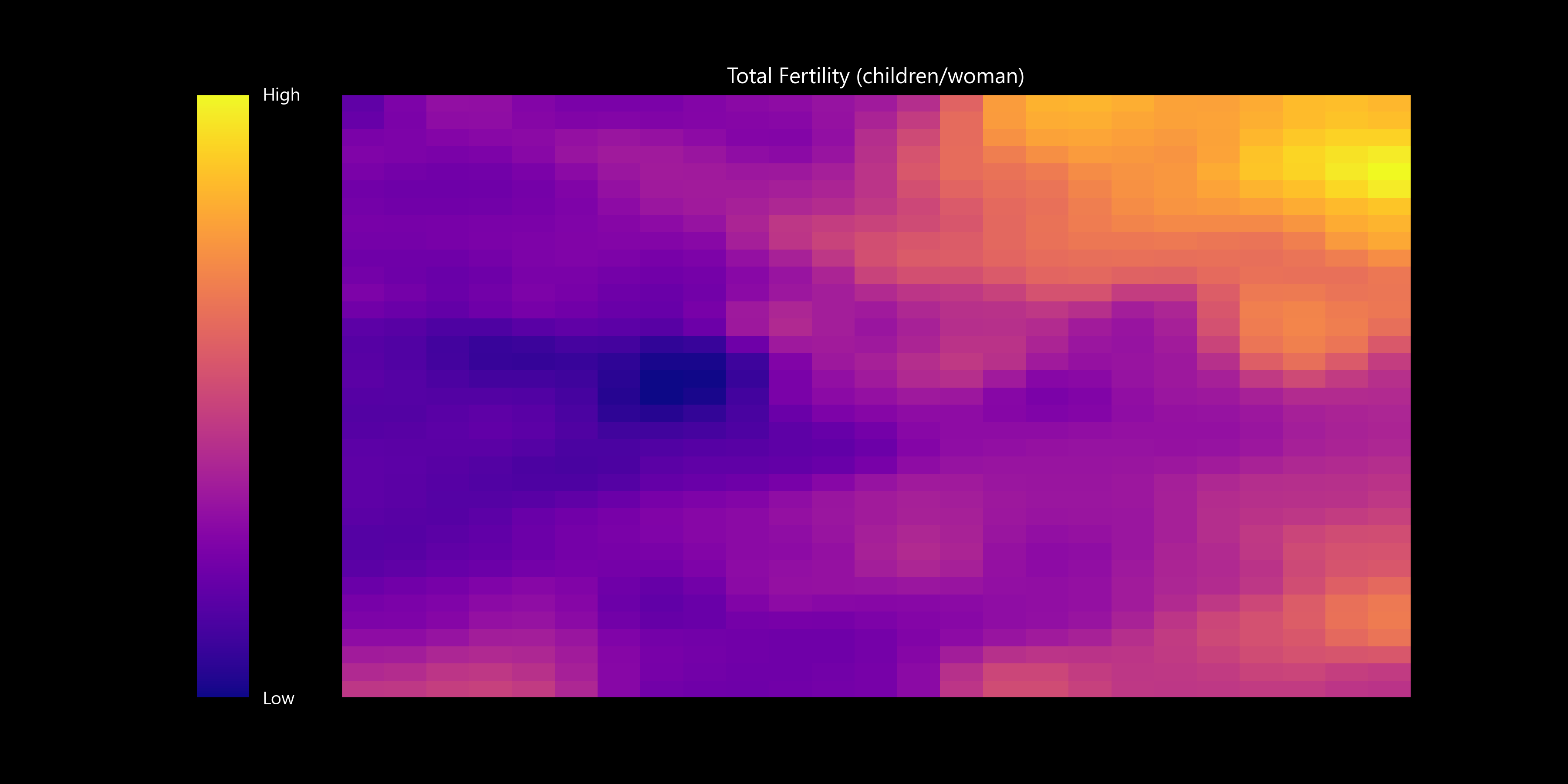
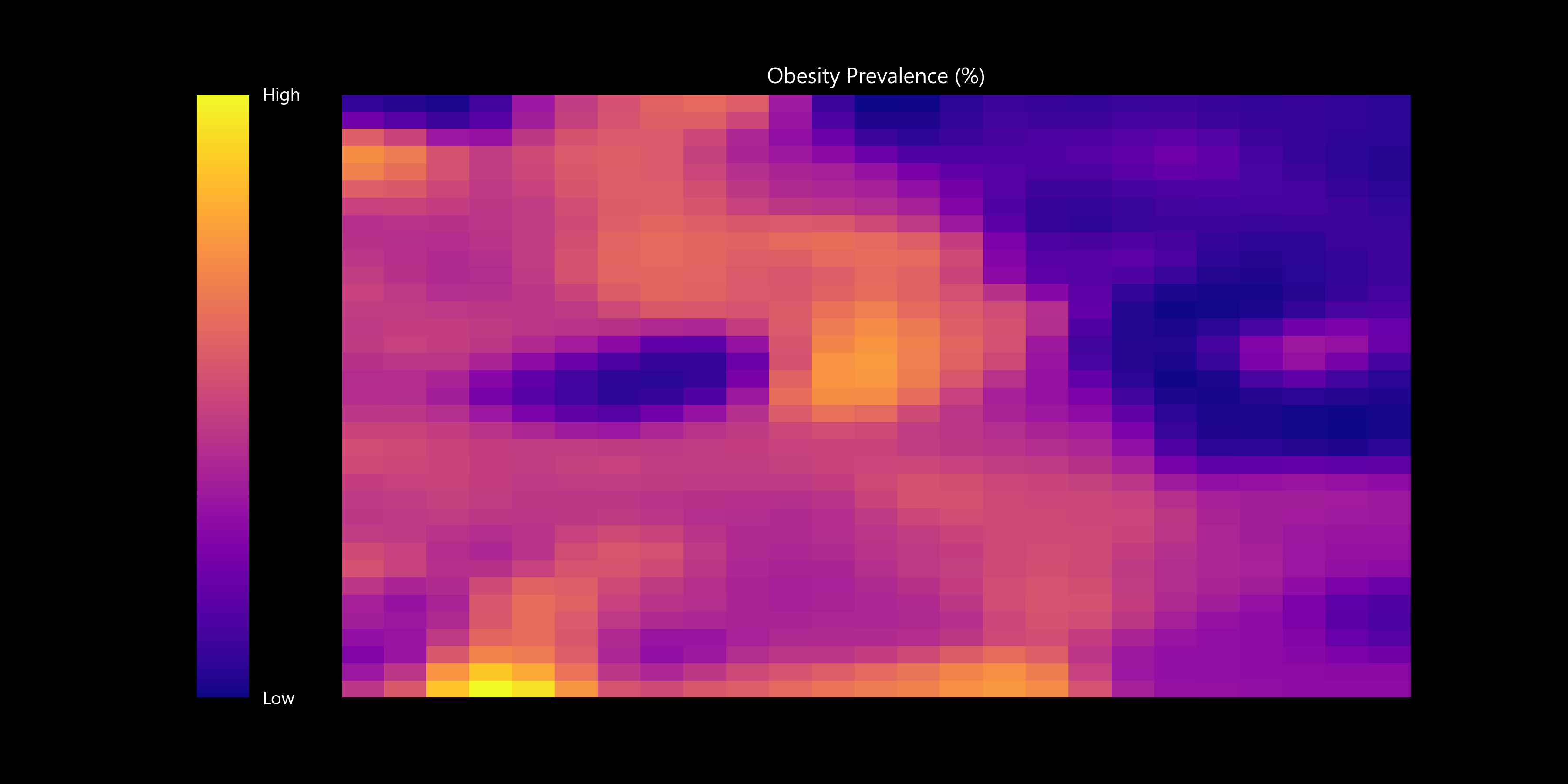
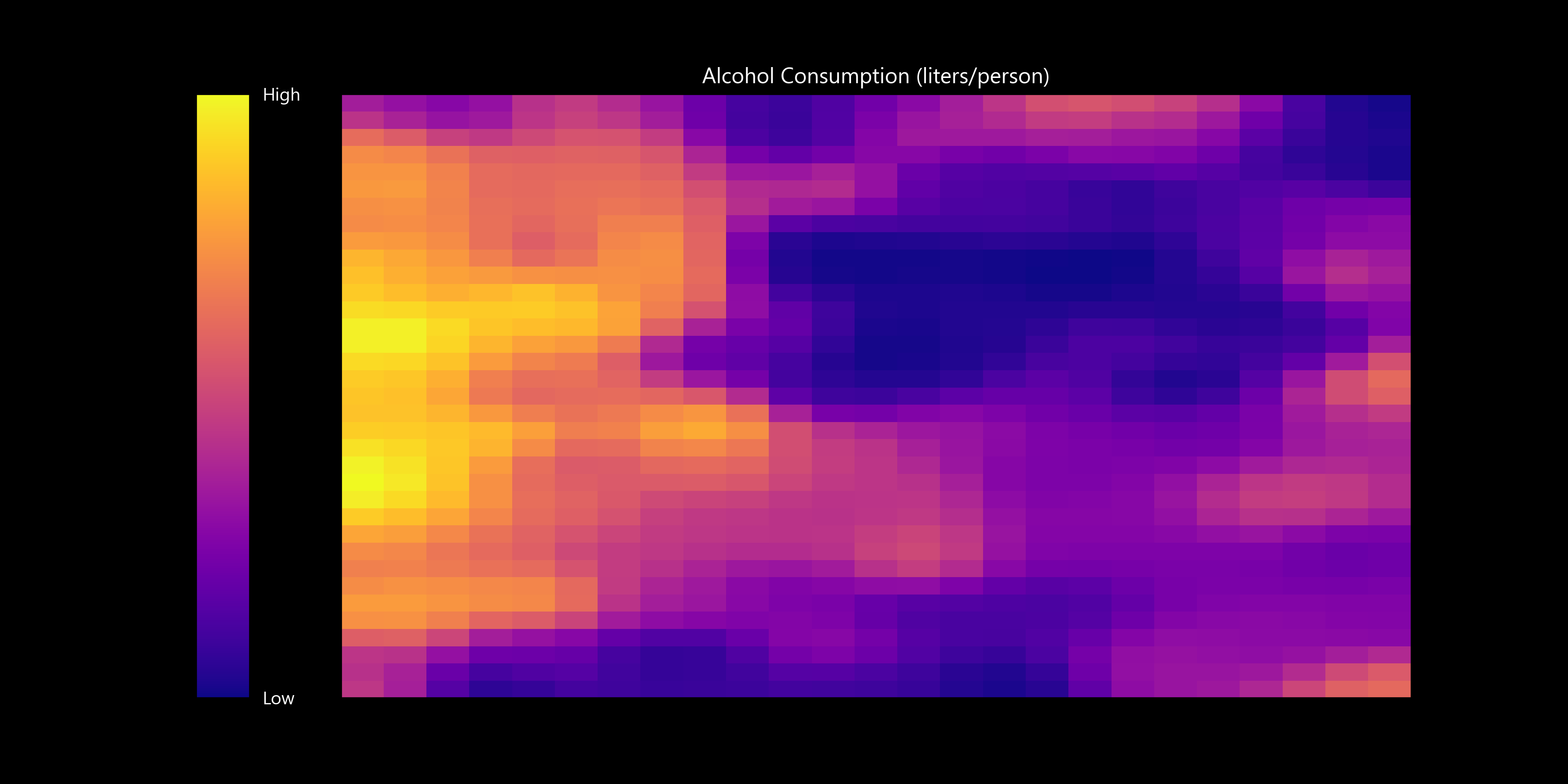
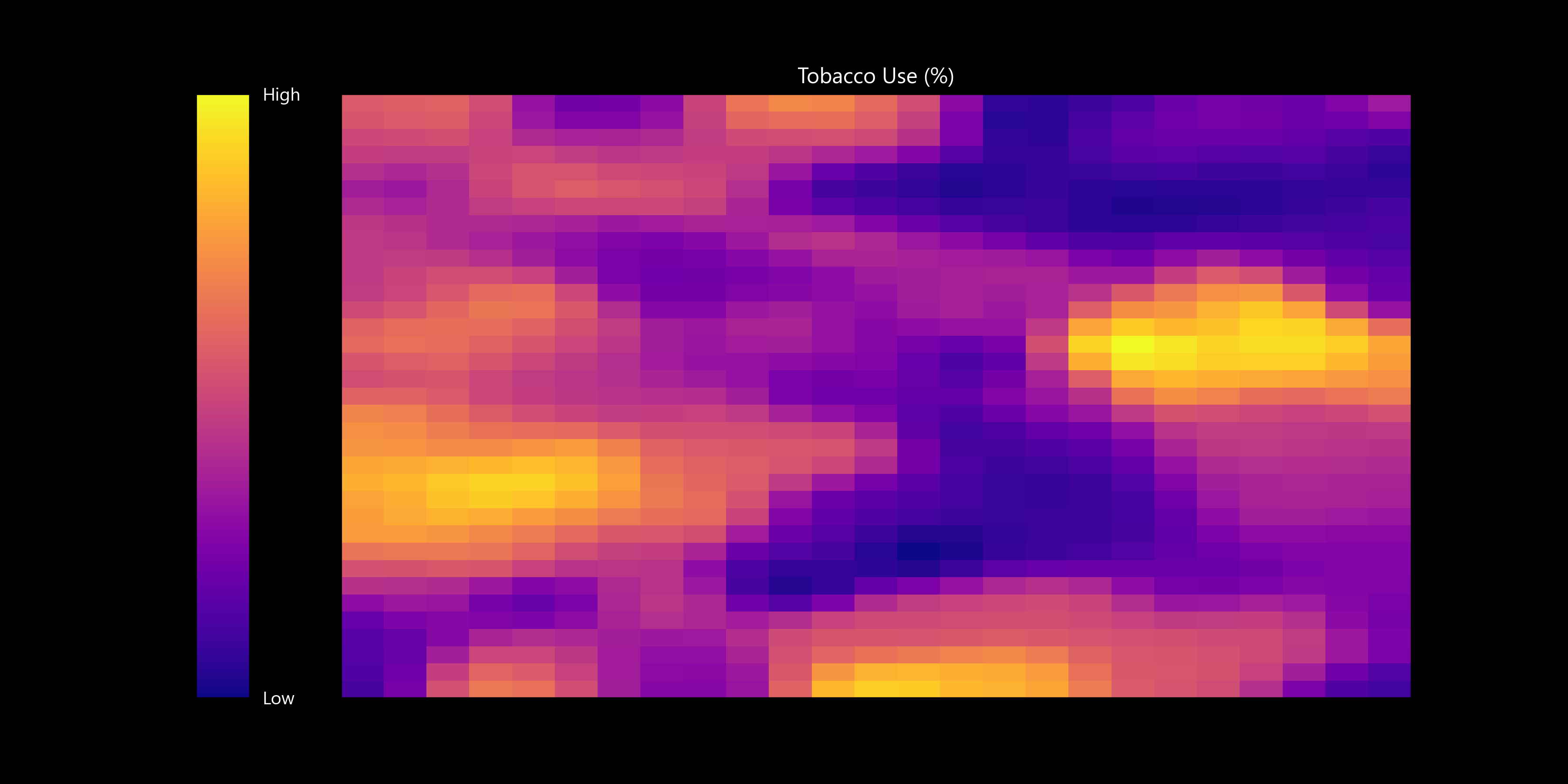
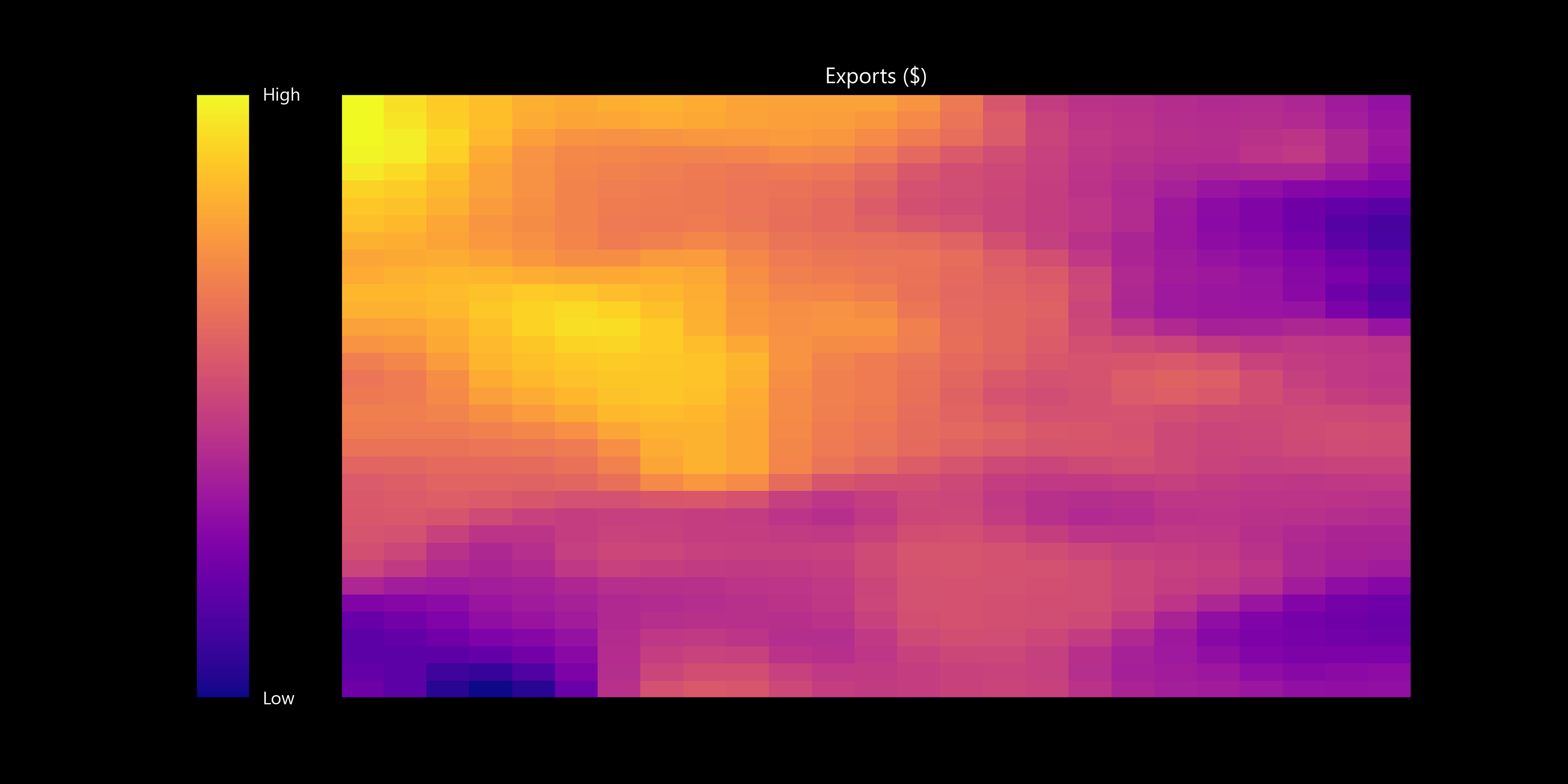
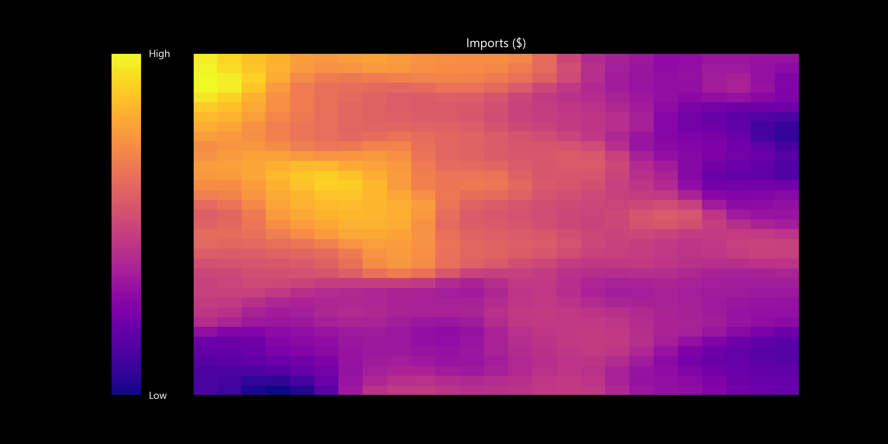
I use the self organizing map (SOM) a lot. It’s a great tool to visualize high dimensional data, select cluster numbers, and explore data. Today I explored The World Factbook, a set of many country-level metrics compiled by the CIA. I fed the country level data into the SOM and allowed it to self-organize into countries with similar metrics. I’ve also plotted some feature plane heatmaps to show you the data that went into this analysis as well as the final trained SOM weights. Enjoy!
Link to data: https://www.cia.gov/the-world-factbook/references/guide-to-country-comparisons/
30DayMapChallenge: https://30daymapchallenge.com/
